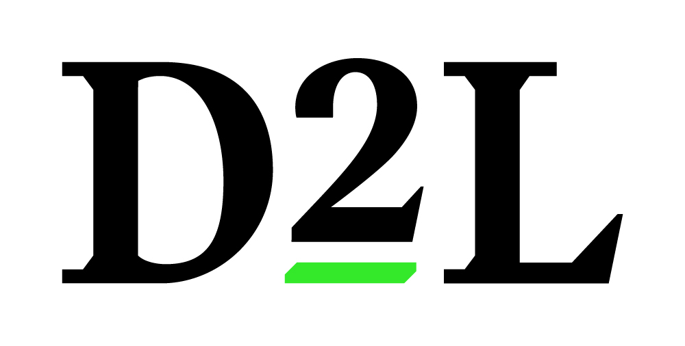
Preferred Logo
When referencing our company, use the preferred D2L logo.
Our company’s official name is D2L. To respect the way that many people know us, we also answer to Desire2Learn. It’s like a person who’s known as Jim but answers to James in certain situation.
When referencing our company, use the preferred D2L logo.
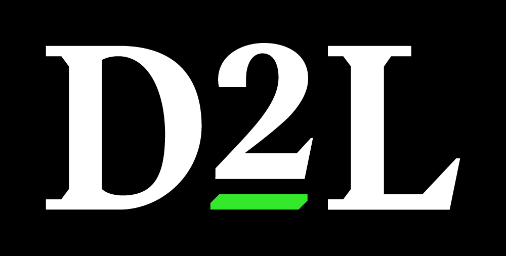
The primary logo underlines the 2 as the feature, it’s raised 2 represents growth, and we underscore it to highlight our focus on partnerships. Our logo is above all legible and recognizable, and should be shown intact and unaltered whenever possible. An inverted version is offered below for specific circumstances.
Print: .eps
Screen (transparent): .png
Screen (solid background): .jpg

The stacked format of the D2L logo is the core of our identity’s design system. It’s best used when given breathing room—as either a focus or sign-off—and should always be displayed with the component elements’ proportions and arrangement intact. Logo clearspace should be approximately the same height as three stacked underlines from under the number 2 in “D2L”.
To maintain clarity and legibility, the logo should maintain a minimum size of 80px wide.

There are other logo treatments that can be used when used on a coloured background, or printing limitations.
A knockout of the logo is primarily used on a coloured background, but it can also be used on an image background if the background is clean and relatively solid in colour. It can also be used on backgrounds where the green underline isn’t visible, or is hard to distinguish.

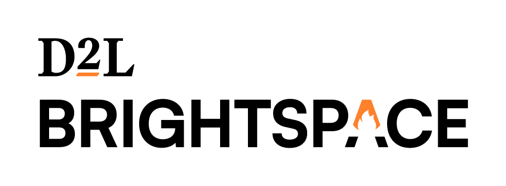
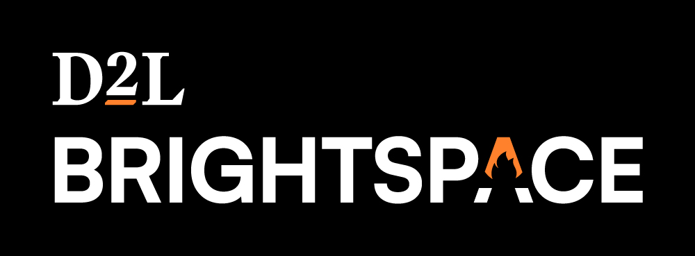
If you are referring to the Brightspace Learning Platform, you can choose to display the D2L Brightspace logo instead of the D2L logo. This entire experience should reflect the D2L Brightspace colour scheme.
The simplicity of the logos ensures that our touchpoints express quality and confidence. This simplicity enables the flexibility we need to speak with our diverse audiences, but always authentic, friendly, and straight-forward tone.
Print: .eps
Screen (transparent): .png
Screen (solid background): .jpg


